typeface spread

For the third project in our C-studio mini, we were assigned a typeface; I received Bodoni, a modern font with high contrast between strokes and generally used in elegant settings.
Prior to this project, I knew the casual differences between typefaces: san serif vs serif, rounded vs geometric, etc. However, it wasn’t until careful considerations of the details of our font did I really begin to understand how even a simple difference in a serif (unbracketed vs bracketed, how thin the serif is, etc.) can cause a difference in the setting of the typeface and the mood it conveys.
I did some initial research on Bodoni and wrote an essay about it, covering its history, usages, highlighting characteristics, why certain attributes of Bodoni allows for certain usages (ex: high contrast allows for sophisticated yet boldness, perfect for high end fashion).
We began exploring spreads, exploring how to best convey our body copy with both visual aesthetics without taking away from the readability of our text. Initially I sketched out some brainstorms of where text and images can go in general before even tackling my body copy.

We also needed to keep whitespace, leading, linespacing, etc in mind as we created our spreads. For my particular font, I wanted to keep plenty whitespace due to Bodoni’s tendency to be hard to read, as well as simply give more breathing room to the reader as they go through the spread.


I mostly used black/white layouts due to their contrasting nature. I thought this would best highlight the bold and “high contrast” nature of Bodoni but later realized I hadn’t been pushing my exploratory boundaries enough.
Still, I later tried some other designs with the same black and white palette to fully test out some contrast, as seen by the spread with black backgrounds, though I decided that light text would be hard to read.


As we started our fourth project, the typeface video, and put this one on hold, I had selected a color palette for my video. After some consideration, I decided to move away from the black/white designs I had previously and move forward with the color palette I had created.


I chose my last spread for more in depth exploration as I enjoyed the way I still highlighted the key characteristics of Bodoni but kept them sparse so that there was still plenty of breathing room for the readers. Even though the ones with a diagonal line had some space in the diagonal block, there wasn’t a lot of room to help with the readability of my spread.
I also thought about using a complimentary san serif font, such as Futura, Brandon Grotesque, Helvetica, etc. In using them, however, it felt a little off as they seemed to all have too much personality and competed with the boldness of Bodoni. It also felt as though the “elegant” touch of Bodoni was lost, so I decided to use Bodoni as my body text instead, and carefully follow Giambattista Bodoni’s own thoughts: “Plenty of white space and generous line spacing, and don’t make the type size too miserly.”
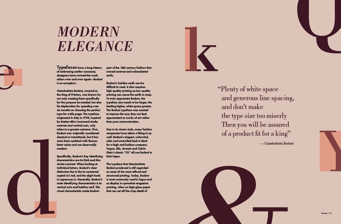
I also played around with how the title and font is presented. I didn’t really like how Bodoni looked across the page; it was too big and too loud and I enjoyed the way I wrote my body copy with a general statement about type and then revealing the font was Bodoni. As a result, I switched my title to “modern elegance” instead and left out a subheader.


